Aston Martin is known for luxurious, sporty design and powerful engines.
So much so that the Aston Martin DB5 is literally considered the James Bond car by lovers of all things automotive and 007.

And now, it seems, Aston Martin is getting a new set of wings on its logo rebrand.
The British automaker recently hired famed graphic designer Peter Saville CBE to update its famous winged logo.

His design changes are subtle and probably won’t overly upset those who loved the old logo. That’s because the new logo respects the company’s heritage while at the same time bringing a fresh, modern look to it.
The old Aston Martin logo featured a green gradient background and a semi-circular line. The old logos lines reflected the original Egyptian inspiration for the design but didn’t quite capture Aston Martin of today.

Saville replaced those elements with a solid British racing green while thickening the lines of the new logo. It now appears bolder but also more streamlined and contemporary. The hope is that Aston Martin’s appeal will spread to younger and more international audience – while at the same time respecting the brand’s heritage.
“Every millimeter of each line – of each shape within the new wings, are drawn forward from the depths of our 109-year Aston Martin creative wellspring,” Aston Martin’s executive vice president, Marek Reichman, told the media recently.
The new Aston Martin logo will also be used in physical badges that will be made by well-known Birmingham silversmiths Vaughtons.
Saville said his tweaks were “subtle but necessary” enhancements to the design that not only to keep the logo fresh but also to allow it to be applied to various formats and technologies in the future.
So how did Aston Martin get those wings on its logo in the first place?

The new set of wings for the new logo, it turns out, has incorporated contemporary cues from each era of Aston Martin and has now evolved into an instantly recognizable icon worldwide.
As Aston Martin launches its bold new brand identity, and updated iconic wings, the British automaker is taking a look at the early history of this iconic marque.
1920

Eager to build the fledgling Aston Martin brand, co-founder Lionel Martin didn’t just aspire to compete with his rivals, he sought to make a different kind of car: a luxury sports car.With an interlocking ‘A’ and ‘M’ in dark green – a nod to British racing green – and its circular, button shape, the original logo was inspired by those of preeminent luxury car brands of the early 1920s. Simple yet sophisticated, the design was led by Lionel’s wife, Kate Martin, and exuded elegance and style.
1921-1927

Except for the Coal Scuttle, the very first Aston Martin and a car raced by Kate herself, the logo was applied to every Aston Martin from 1920 to early 1927, including our first Grand Prix car, TT1, which after being sold by the team became affectionately known as ‘Green Pea’ owing to its color and Grand Prix – or ‘GP’ – racing heritage.The Roaring Twenties brought more than flapper dresses, frivolity and a cartoon mouse by the name of Mickey – the Aston Martin brand got its wings for the first time.Technological advances led to milestones in aviation that captured public imagination, such as the first non-stop transatlantic flight, and brands sought to capitalize on people’s fascination with flying. Any car company with a link to aviation made it known and even those that didn’t alluded to possible connections with the industry.
1927

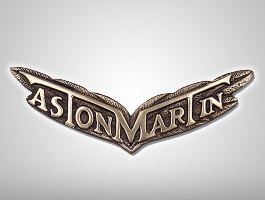
Motivated by this popular aviation trend, this year saw the introduction of the first iteration of the wings that would become synonymous with Aston Martin. The wings symbolized speed, and the ‘A’ and ‘M’ of the original logo were replaced with the company name – stylized so that the centrally positioned ‘M’ connected with the horizontal elements of ‘T’. The designer remains a mystery to this day.
Check our our latest!


